What is Nonprofit Graphic Design?
Every nonprofit, from the Gates Foundation to a startup organization that operates out of a garage, has a story. This story is the most powerful tool you have in your arsenal to get people to support your cause.
Since the advent of the digital age, virtual communication has become nonnegotiable for pandemic-era fundraising and connecting with donors. This is where graphic design enters the picture.
Many nonprofits have innovated their brand identity through graphic design. Images are powerful because they can communicate what words cannot. They can not only fortify your brand identity, but they can also communicate to your audience in a meaningful way.
That’s why the top nonprofits on the web have started to tell their stories through visual imagery. If you need tips for creating compelling graphic designs to make your organization’s storytelling professional, poised, and poignant, keep reading! In this guide, we’ll cover foundational graphic design tips before diving into stylistic tips to help your nonprofit get started making the best possible impression.
Tip #1: Define your goals
Tip #2: Keep it simple
Tip #3: Figure out your graphic’s intended purpose
Tip #4: Use established tools
Tip #5: Connect with colleagues in the space
Tip #6: See which other graphics inspire you
Tip #7: Use hierarchy to organize the graphic
Tip #8: Don’t use too much text
Tip #9: Use a cohesive and attractive color scheme
Tip #10: Use easily legible fonts
Tip #11: Be creative!
Foundational Nonprofit Graphic Design Tips
Tip #1: Define your goals
This is the first step when you embark on your graphic design journey. What kind of nonprofit do you want to come across as? Are you going the more traditional route, with stock images and business-style infographics? Or do you want to be more bright, colorful, and inventive? There’s no wrong answer, and you know your nonprofit better than anyone. Pick a style that’s cohesive with your brand and mission.
Some more goals that you should figure out ahead of time with your team are your content goals. Figure out what kinds of content your graphic design is going to enhance. Here’s a list of different applications for your graphic designs:
- Social media/website art
- Printed materials (books, fliers, magazines, and newsletters)
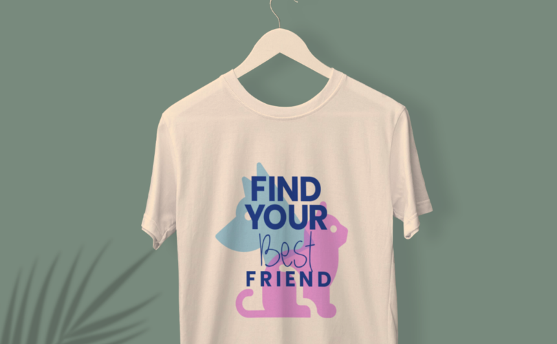
- T-shirt and clothing design
- Your organization’s logo
- Business/greeting cards
These are only a few of the vast array of possibilities. You can leverage graphic design and use it however would best transform your organization. Your return on your time invested will certainly make it worthwhile!
Tip #2: Keep it simple
If you’re reading this post, you’re probably not a graphic design expert yet. That’s okay! You don’t have to be designing at the level of professionals in technology companies during your first brainstorming session. Everybody has to start somewhere, and you don’t want to bite off more than you can chew from the very beginning. So, minimalism is your best friend.
Minimalism is a type of graphic design that underscores the importance of a clean, crisp, and cohesive style. This style is meant to look effortless, but in reality, there are certain strategies you can use to make your minimalist graphic design evoke certain moods and auras. Here’s an example of an awesome use of minimalist nonprofit graphic design:
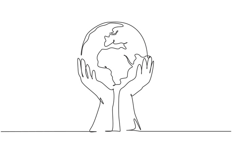
See how the graphic choices are evocative, yet still simple to create? That’s the beauty of graphic design. Consider starting here when you start planning your content.
Tip #3: Figure out your graphic’s intended purpose
In graphic design, there’s a big difference between a social media post and a meeting infographic. They probably need to be created with different tools and platforms. So, in the planning phase, decide what you need to use your graphic for. If it’s for an annual report or a flier, more text is okay than it is for a billboard or a social media banner. This isn’t a one-size-fits-all scenario, and you’ll save a lot of time determining the uses in advance.
Picking the platform ahead of time will help you establish your image size and aspect ratio. Both of these statistics are important to figure out ahead of time so that you can size your content correctly. For example, an aspect ratio for a vertical Instagram story is going to be different than for a horizontal social media banner. There are many free tools that can accurately resize your image while preserving the pixel quality to fit whatever you need the design for.
Also, knowing your graphic’s intended purpose will help you structure the layout and style of content. For instance, your audience and style will probably change between a business card and a clothing design. So, be cognizant of any possible alterations needed as you design your graphics.
Tip #4: Use established tools
If you’re feeling overwhelmed about starting your graphic design campaign, you’re in good company. Scores of professionals are starting to learn graphic design to use in their careers. Numerous services and platforms have emerged to accommodate the high demand for graphic design. In the digital age, you never really have to start from scratch!
There are many platforms that you can use to make your designs come to life. For example, Kwala is a platform that specifically creates graphic design for nonprofits by matching organizations with dedicated designers to provide one-on-one help. Additionally, here are some more sites for graphic design resources:
-
- Canva
- Depositphotos
- Microsoft Excel
- Shutterstock
- Pexels
- Adobe Express
- Pixlr
- Vistacreate
As previously mentioned, there are a plethora of platforms available to accommodate the immense demand for graphic design resources. You can be the judge of the site that works best for you and your nonprofit! For even more resources, check out Double the Donation’s list of nonprofit graphic design tools.
Tip #5: Connect with colleagues in the space
The best form of flattery is imitation! Take some time to peruse some of the best nonprofit websites to see if there are any graphic design styles that particularly speak to you. If you have colleagues at the organization that are willing to help you, reach out and set up a meeting. They can give you some advice and guide you along the path to picking the best design for your organization.
Tip #6: See which other graphics inspire you
The beauty of the internet is that it’s an endless source of ideas and inspiration. There are countless examples of different styles of graphic design for you to peruse and study. Try looking into distinct styles of graphic design to see which speaks to you the most. Here are just a few examples of various types of graphics to consider:
Stylistic Nonprofit Graphic Design Tips
Tip #7: Use hierarchy to organize the graphic
If you’ve ever written an essay or blog post, you understand how important it is to organize your content. The same rules apply while designing your graphics.
Using smart design elements is critical for leading your reader’s eyes along with the page and helping them discern the information they need. Here are some best practices for content organization:
-
- Include headers and subheaders. This is perhaps the most fundamental organizational element for any piece of content. This step is important to arrange your information in a way that makes sense to the reader. Plus, it’s also the best way to guide your audience’s attention along the image so that they glean all of the necessary details.
- Use lines and physical dividers as design elements. Use color, highlights, and shadows to your advantage to subtly guide your reader’s attention across the graphic.
- Change the size of your text. For big ideas, make the text larger and more eye-popping. For the smaller details, make it smaller and less in your reader’s field of vision.
Having a clean, crisp hierarchy is the best way to avoid confusion from your viewer. If you want to make sure your graphic is organized, get someone else to examine it. Having a fresh pair of eyes is the best way to get a new perspective on your work.
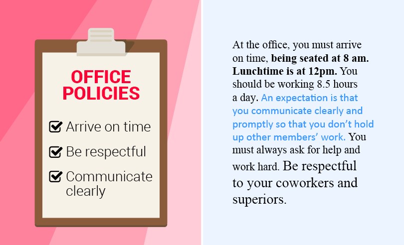
Tip #8: Don’t use too much text
While cliche, the saying “a picture is worth a thousand words” is really true in the graphic design world! Graphic design exists to tell a story through visual elements. Whether it’s a header on a blog post or a billboard on the interstate, graphic design is meant to evoke a feeling from the viewer and create a sense of brand identity mainly from imagery. You don’t want to cover up all of your beautiful images with text.
If you’re designing a flier or a pamphlet that is meant to have more text, don’t cram it all on the page. Make sure there’s white space so that the information is easier to read and more digestible. Blank areas, dividers, and bullet points are the way to go instead of a series of long paragraphs.
Try playing around with stock images and adding some basic text on top. Short, evocative slogans and sayings are more effective than squeezing a bunch of text on the page. Your audience will lose interest in what you have to say, and you could lose a potential donor or member. Keep your messages short, sweet, and to the point! To help you get started, here’s an example of good use of text and bad use of text on a graphic:
Tip #9: Use a cohesive and attractive color scheme
Have you ever wondered why we use colors to describe certain emotions? If you’re “feeling blue” or “tickled pink,” you know the power colors have to impact our moods. We’re taught from a young age to associate certain colors with certain emotions, and you can take advantage of this fact in your branding by choosing a certain color scheme.
Once you’ve figured out what kind of mood you want your branding to channel, you can match it with the appropriate coloring. Here’s a guide to some of the psychology behind color grading:

Another color consideration is picking hues that compliment each other. For example, don’t pick too many neon or oversaturated colors, as they will likely clash and be distracting to your reader. Having a few bright colors is good to catch your reader’s attention, but don’t overdo it!
Also, consider the impact of shadows and highlights. Use different hues to shape the contours of the graphic and bring depth to the image. Here’s an example:

The shadows make the image more compelling and layered while still being in a minimalist style. This is a great strategy for nonprofit graphic designers to convey more meaning in their work and make their message stand out from the page. Plus, many of the apps mentioned above have easy ways to add shadows and highlights to your image. Let your imagination go wild!
Tip #10: Use easily legible fonts
A typography consideration for your nonprofit is picking the correct font. Fonts have the power to implicitly impact the overall aesthetics of the piece. Plus, different fonts impart different emotions and meanings to the reader. Here are some of the most widely used fonts by graphic designers:
All of the fonts you consider should be legible and not confusing to your reader. But, as you can see, all of the fonts above have their own style and embody different aesthetics. So, you should consult with your team to pick a font that best displays the mood of the content. Be sure to be strategic and cohesive with your fonts!
Tip #11: Be creative!
Graphic design is so fun because there are endless possibilities for you to create and explore. You shouldn’t feel discouraged if none of the images throughout this post has piqued your interest. Embarking on your graphic design journey is a means of claiming your own brand identity, so you should make it your own accordingly.
Remember, graphic design is an art, not a science. There is no right or wrong way to do it! This article is meant to introduce you to strategies and styles to better organize your branding and grab your audience’s attention. Anything you want to create is fair game in your graphic design portfolio. Just be cognizant of how you want your brand to come across to your audience. You’ll be amazed by how your graphic designs will transform your nonprofit!
Additional Nonprofit Graphic Design Resources:
What is Subscription Graphic Design?
5 Things to Keep in Mind When Designing a Logo
The Meaning of Color in Logo Design