A nonprofit’s website is the heart of its mission, the voice of its cause, and the bridge to its community. Imagine a potential donor landing on your homepage and being captivated by its graphic design, inspired by the stories, and motivated to make a conversion.
Whether you’re launching a new site or revamping an existing one, the right approach can make all the difference. In this article, we’ll explore over 100 stellar examples of nonprofit websites, share essential tips for creating an engaging online experience, and cover everything you need to know to achieve your goals. We’ll explore these topics in particular:
- How to Boost Your Nonprofit Website’s Visibility
- Top Nonprofit Website Trends To Know
- Designing A Nonprofit Website
- Websites from Medical Organizations
- Websites from Arts and Culture Organizations
- Websites from Environmental and Animal Rights Organizations
- Websites from Community and Economic Development Organizations
- Websites from Human Rights Groups
- Websites from Child Development and Youth Programs
- Websites from Religious Organizations
- Top Nonprofit Website Builders To Consider
Top Nonprofits’ mission is to help nonprofits learn from the best organizations and leaders operating in the sector. In keeping with that objective, we’re excited to share the best nonprofit websites to inspire organizations like yours. Now, let’s dive in and transform your website into a powerful tool for impact and change.

Increasing your nonprofit website’s visibility is crucial for attracting donors, volunteers, and customers. To drive traffic, incorporate your nonprofit website into all communications by including it in your organization’s newsletters, social media profiles, printed materials, and staff members’ email signatures.
Then, elevate your visibility further with search engine optimization (SEO) and Google Ads. These powerful tools can help you expand your audience and connect with valuable leads. Here’s how to leverage these strategies:
Optimizing for Search Engines
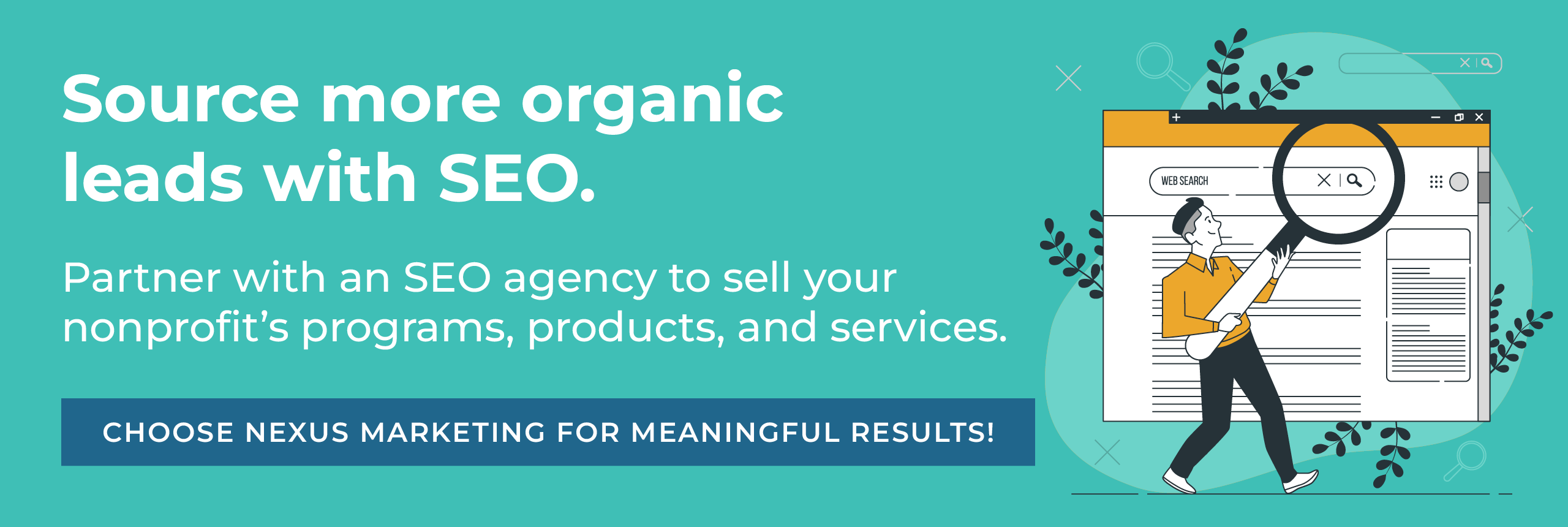
SEO is the process of enhancing your website’s ranking on search engine results pages through targeted keywords, high-quality content, technical improvements, and backlink building. Optimizing your nonprofit website for organic search makes it easier for donors, volunteers, advocates, and beneficiaries to discover your mission on search engines like Google.
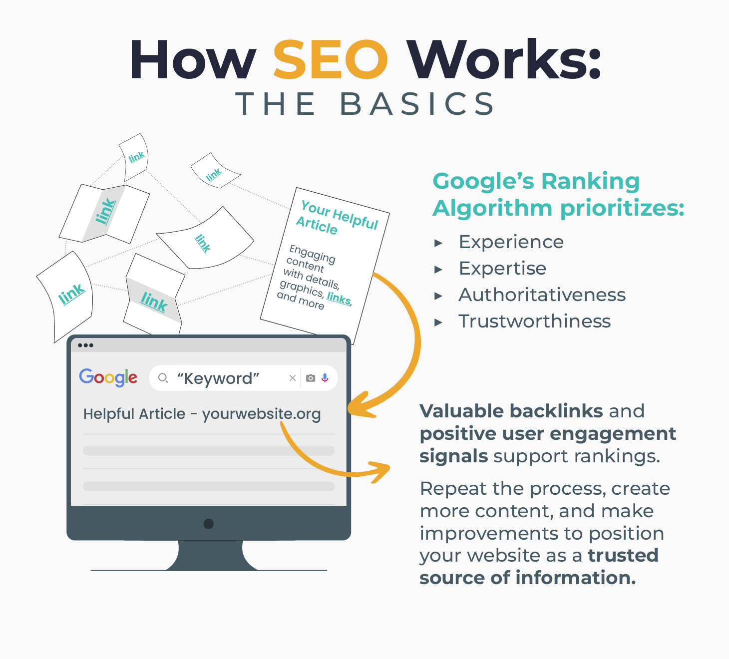
Despite the power of SEO, the 2023 Nonprofit Tech for Good Report explains that only 37% of nonprofits have an SEO strategy. To ensure your nonprofit stands out online, incorporate these elements into your SEO strategy:
- Keyword Research: Identify relevant keywords that potential supporters might use when searching for nonprofits like yours on Google.
- On-Page SEO: Optimize page titles, meta descriptions, headers, and alt text for images to improve search engine rankings.
- Content Strategy: Regularly update your blog with high-quality, engaging content that provides value to your audience.
- Backlink Building: Earn backlinks from reputable sources to establish your website as authoritative in your industry.
- Technical SEO: Improve page load speeds, ensure mobile-friendliness, and fix broken links to enhance your site’s user experience.
- Analytics and Monitoring: Use tools like Google Analytics to track performance and adjust strategies as needed.
By implementing these elements, your nonprofit can significantly improve its online visibility and attract more supporters.
Our Recommended SEO Agency
While it’s possible to make significant SEO gains for free, many organizations partner with SEO agencies like Nexus Marketing to skip the learning curve. Nexus Marketing specializes in nonprofit SEO for charitable organizations that sell products and services. This means they understand the unique challenges and opportunities nonprofits face when marketing their offerings online.
As our recommended agency, Nexus Marketing has an impressive network of 500+ partners in the mission-driven space, conducts extensive keyword research, consistently creates high-quality content for its clients, and focuses on ROI to generate qualified sales leads.
This agency has a proven track record of success, such as helping the nonprofit publishers at David C Cook rank for 187 of their most important tracked keywords. They also helped transform two core SEO pages into new organic lead source channels. That means you can relax knowing that Nexus Marketing is well-equipped to improve your SEO rankings and drive more sales.

Leveraging Google Ads
While SEO is crucial for long-term visibility, Google Ads offers an immediate way to drive traffic to your nonprofit website and encourage specific actions, like donating, volunteering, or purchasing a service. By leveraging paid search advertising, you can reach potential supporters quickly and effectively.
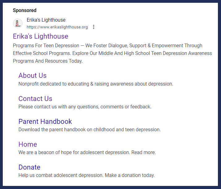
Here’s a compelling example of search engine advertising from the nonprofit Erika’s Lighthouse:
To create ads that are just as informative as Erika’s Lighthouse, here’s how to maximize the impact of Google Ads for your nonprofit:
- Craft strong ad copy. Write compelling ads that capture attention and encourage clicks. Highlight your nonprofit’s mission, upcoming events, success stories, and ways to get involved. Use strong calls to action to motivate potential supporters to visit your website and take action.
- Choose relevant landing pages. Ensure that the landing pages your ads link to are relevant to users’ search intent, easy to navigate, and optimized for conversions. A well-designed landing page should clearly communicate your message, provide valuable information, and include clear calls to action such as donation buttons, volunteer sign-ups, or product offerings. If you’ve already optimized your pages for SEO, you should be good to go!
- Use targeting features. Reach specific audiences based on their demographics and search behavior. Identify high-intent keywords related to your nonprofit’s mission and focus your ads on these terms.
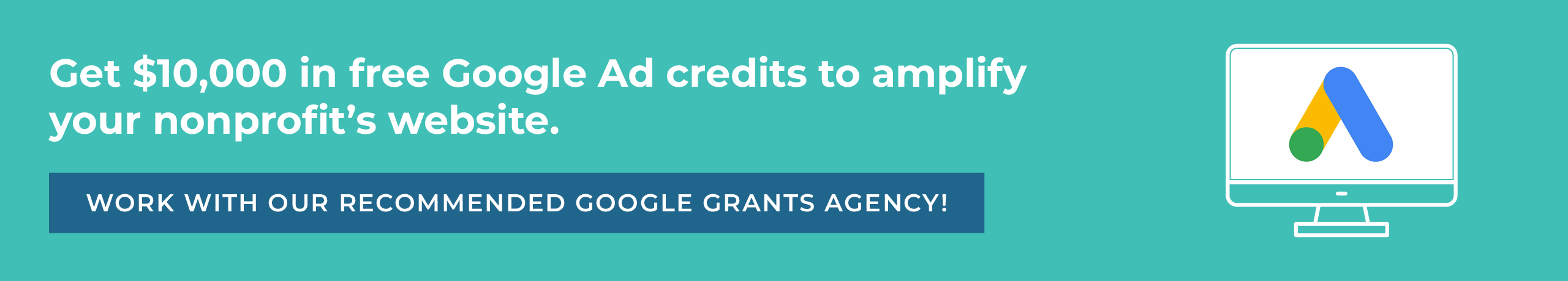
Best of all, you can tap into this channel for free. Through the Google Ad Grants program, eligible nonprofits can earn up to $10,000 in free ad credits to promote their nonprofit websites within Google Search results.
Our Recommended Google Ad Grant Agency
While a great resource, the Google Ad Grants program can be tricky to navigate. Turn to our recommended Google Ad Grant agency for help!
Getting Attention can confirm your nonprofit’s eligibility, apply to the program for you, create optimized campaigns, and keep you in compliance with the Google Ad Grant rules. Their expert team offers tailored strategies, ongoing support, and in-depth reporting to help your nonprofit make the most of the available grant funds.
Whether you want to raise awareness, recruit volunteers, increase donations, or sell your products and services, Getting Attention will help you achieve your Google Ad Grants goals.
There are over 1 billion websites in the world, and nearly 4 million more are created every day. In the crowded digital landscape, a strong nonprofit website design can significantly boost your fundraising potential and outreach efforts. While specific design elements vary across different sectors, the most effective nonprofit websites implement common principles that enhance engagement.
Here are a few common trends you’ll notice among the outstanding nonprofit websites we’ll cover:
- Responsive Design: Content that automatically adapts to different screen sizes ensures a seamless experience for all visitors, whether they are using a desktop, tablet, or smartphone. This is especially important considering that mobile devices account for 57% of all nonprofit website traffic.
- Strong Hero Images: By featuring impactful images at the top of each page, you can communicate your nonprofit’s mission and make an immediate impression, drawing visitors in and compelling them to learn more.
- Simplified Navigation: Menus with fewer navigation options make it easy for users to find key information, reducing frustration and keeping the focus on your most important pages.
- Animated Backgrounds: Subtle background animations can create a dynamic and engaging experience, enhancing a site’s visual appeal without overwhelming the user.
- Clear Infographics: Informative and visually appealing infographics communicate complex information more effectively than text alone, helping visitors understand your offerings and impact.
- Varied Visual Content: A mix of photos and graphics breaks up text, keeping your content engaging and easy to digest, while also helping tell your nonprofit’s story.
- Multiple Giving Opportunities: From donating to volunteering to corporate giving, the best nonprofit websites feature different ways for supporters to give back, ensuring there are opportunities for different interests and every budget.
- Effective Calls to Action: Nonprofits selling products or services use clear, compelling calls to action to drive sales and engagement, making it easy for visitors to support their mission.
By accounting for these trends in your nonprofit’s web design, you can create an engaging, user-friendly experience that effectively communicates your mission and inspires action.
Before we dive into some outstanding nonprofit websites, it’s helpful to know how you can build a powerful digital presence of your own. To start, you need more than just a basic template; you need an accessible, visually appealing design that communicates your mission and drives supporters to take action.
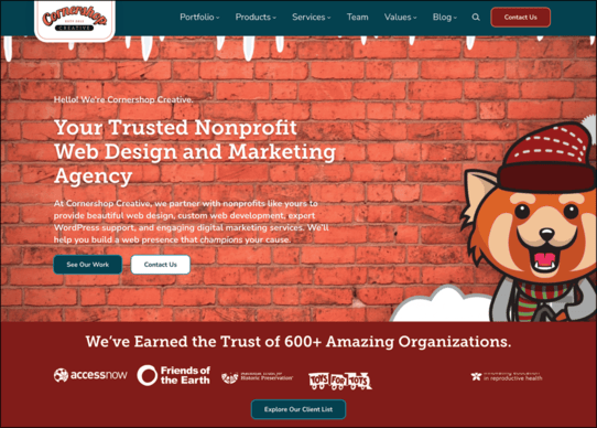
Cornershop Creative
Working with a specialized web development agency ensures your site is both visually attractive and technically sound. We recommend working with Cornershop Creative, a full-service digital agency dedicated to helping nonprofits build better websites.
Since Cornershop Creative specializes exclusively in mission-driven organizations, they are your ideal partner for:
- Designing custom WordPress sites: From stunning visual redesigns to complex user experience (UX) overhauls, they build fast, secure, and fully accessible websites tailored to your mission.
- Keeping your website optimized and secure: Through ongoing maintenance and reliable hosting, their team ensures your site runs smoothly and safely.
- Integrating complex donor CRMs: They seamlessly connect your website to powerful donor management platforms like EveryAction, Salesforce, and Engaging Networks to streamline your donation forms and data syncs.
- Executing holistic digital marketing strategies: Beyond the initial website build, they help you expand your reach and drive traffic through proven SEO tactics, content strategy, and expert Google Ad Grants management.
If you’re interested in elevating your nonprofit’s digital presence with expert development and strategic design, explore their extensive portfolio. Then, reach out to the Cornershop team to discuss your next project.
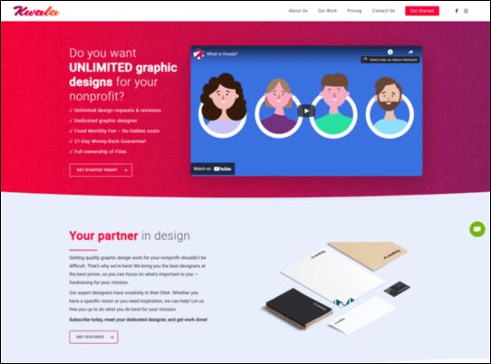
Kwala
You’ll need to leverage a quality CMS like WordPress to build your website. Then, you’ll want high-quality graphics that communicate your mission, make your site visually attractive, and engage your supporters.
We recommend working with Kwala, a subscription-based graphic design company. Since Kwala specializes in nonprofit graphic design, they’re the ideal choice for mission-based organizations looking to create or update their websites with professional graphics. Plus, they offer a wide variety of services from web graphics to logo design to flyers to level up every aspect of your brand’s marketing — both online and offline.
If you’re interested in elevating the quality of your nonprofit website with stunning and informative graphics, fill out Kwala’s onboarding form to meet your designer and get started.
When paired with an effective layout, well-designed graphics can transform your nonprofit website to be a major asset for your cause.
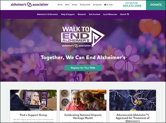
Alzheimer’s Association
The Alzheimer’s Association’s website immediately catches the eye with a bold hero image that shows off an array of purples. The dominant purple color scheme also draws attention to the light green donate and registration buttons, as well as the conveniently placed help phone number in the heading. These color choices ensure visitors will remember the Alzheimer’s Association’s brand colors, while also directing their attention exactly where the website designers want—to links where they can take action and engage with the website’s content. Not to mention that the pairing of purple flowers with green accents cleverly calls peaceful nature imagery to mind, while also looking nice together.
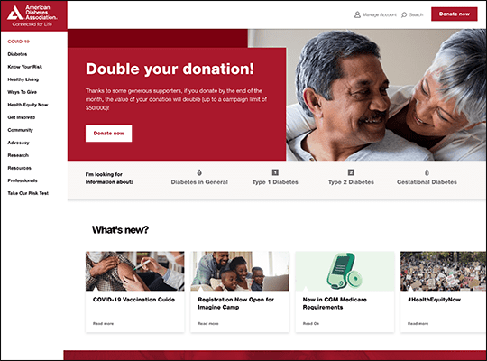
American Diabetes Association
The American Diabetes Association understands that they have a lot of information to present to visitors and has organized their navigation menus accordingly. In order to avoid overwhelming visitors, their website divides its navigation into two sections, a vertical navigation bar running along the side with a wide range of topics and a horizontal menu that pairs each core topic with an icon. The content of the menus is also divided appropriately. The vertical menu provides information from the entire website, whereas the horizontal one focuses solely on information about diabetes, which corresponds with the American Diabetes Association’s mission. Plus, they’ve also made sure their donation button can’t be missed by separating it from the menus entirely and placing it high in the upper right-hand corner.
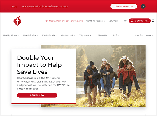
American Heart Association
The American Heart Association’s website shows off how a minimalist design can still be impactful and direct visitors to key engagement opportunities. Instead of outlining images or using a sharp color contrast, page elements such as photos and sections are divided by a subtle shadow effect, giving the page a sense of depth without diverging from its strict color palette of white, black, and red. This design choice creates a sense of consistency as visitors scroll down the homepage, while also mirroring the American Heart Association’s logo, which has the same color scheme and subtle shading style.
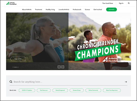
Arthritis Foundation
The Arthritis Foundation is a good example of how animation can be used to catch a visitor’s attention without leaning on unnecessary or overly flashy visuals. Their image carousel paired with a few animated transitions creates a sense of movement without feeling disorienting. Plus, the shaded half of the image lines up perfectly with the dividing line on the lower navigation bar that follows visitors as they scroll. Then, when visitors hover their mouse over the lower navigation bar, they’ll see the same type of shading as featured on the image carousel, tying the entire visual presentation together.
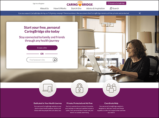
CaringBridge
CaringBridge sticks to a rather classic website design style to encourage engagement—a hero image paired with a form visitors can fill out to get involved. This design choice is a classic because it works, drawing immediate attention to the action CaringBridge ultimately wants visitors to take when browsing their website. For added convenience, they’ve also gone the extra mile to include a search feature in the very same section as their call-to-action form, giving visitors the option to continue looking around before making a decision about whether to join CaringBridge’s website creation program. It’s also worth mentioning that they have a very cute heart icon on their donation button, giving it an extra flair that might catch a potential donors’ eye.
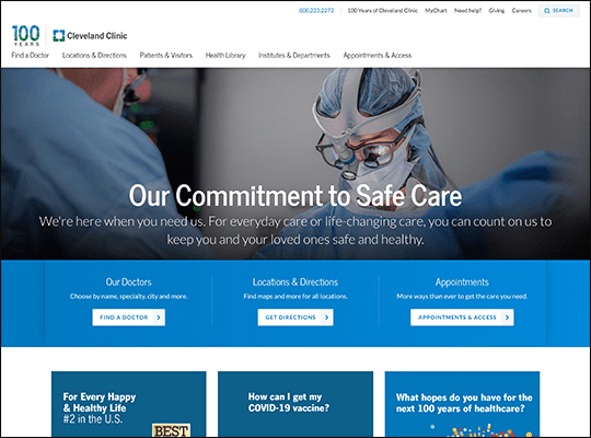
Cleveland Clinic Foundation
The Cleveland Clinic Foundation’s website showcases their organization’s dedication to professionalism. Like many medical websites, their website adheres to a limited color scheme, consisting of just blue, white, and black. However, as their logo shows, they also strategically use bold green images to draw visitors’ attention to important updates, such as their message on scheduling COVID vaccines. This choice also makes their logo and its incorporation of the added green color stand out all the more, as it’s surrounded by blues and whites. Visitors with a careful eye will also notice this color scheme even extends to the icons above the links to resources for patients and doctors, which at first glance might be mistaken for black.
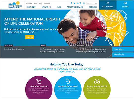
Cystic Fibrosis Foundation
Unlike most of the medical websites on this list, the Cystic Fibrosis Foundation’s website makes bold color choices, mixing yellow, purple, and multiple shades of blue in their hero image alone. When combined with a hero image that is really three images merged together, this might make for a busy homepage. However, these image choices showcase the wide range of constituents the Cystic Fibrosis Foundation serves, while still making sure the most important buttons (Get Involved and Donate) are easy to find by placing them above the mix of colors.
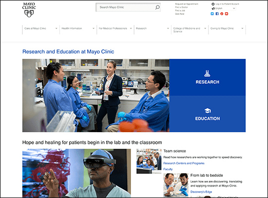
Mayo Foundation
The Mayo Foundation’s website is tasked with balancing every side of the organization it represents: patient treatment, research, and educational resources. Their homepage meets this challenge by including a variety of images that picture researchers in discussion with one another, medical students in an educational setting, and patients receiving treatment. Not to mention, their large menu directing visitors to their research and college websites, respectively also clearly spells out their variety of services. Plus, check out the Mayo Clinic College of Medicine and Science’s website for an example of how animated backgrounds can create a striking first impression.
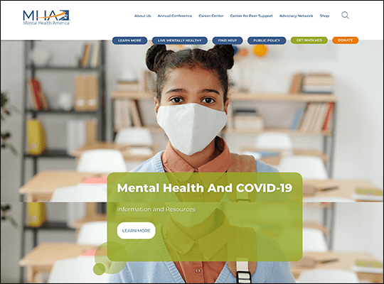
Mental Health America
Mental Health America shows off how web design can unify their content not just through brand colors, but also by shape and design. Through the simple design choice of rounding the corners of every button, photo, and menu items, Mental Health America is able to display a wide range of content and colors without making their website seem overly busy or disjointed. Additionally, the positioning of their menu items along the top of the image carousel helps create an added visual effect that makes the next image timer look like a loading bar, making visitors curious about what will happen when the bar makes its way through each button.
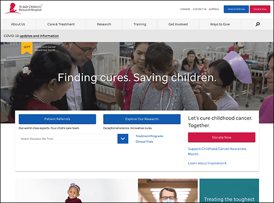
St. Jude’s Children’s Research Hospital
Instead of static photos or image carousels that change pictures every five seconds or so, more nonprofits have been experimenting with animated backgrounds and using short video clips. St. Jude’s Children’s Research Hospital’s hero image shows how effective this choice can be while also easing visitors into the moving images by starting off with a still photograph. However, St. Jude’s website doesn’t stop there, also showing off how animated typography can make a website feel more dynamic in their collage of photographs and subtly patterned tiles representing current news stories.
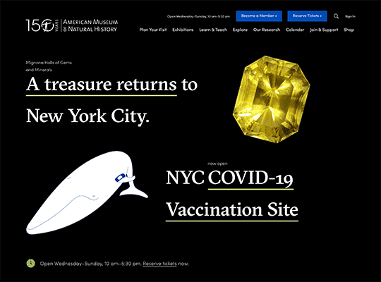
American Museum of Natural History
The American Museum of Natural History uses its space above the fold to bold effect, placing images of its core exhibits on a black background with only limited text to accompany them. The text introducing each of these exhibits also leaves a lot to the imagination with enigmatic titles such as “A treasure returns to New York,” intriguing visitors, while also giving them enough context clues with images and links to highlight key exhibits and give them a sense of mystery.
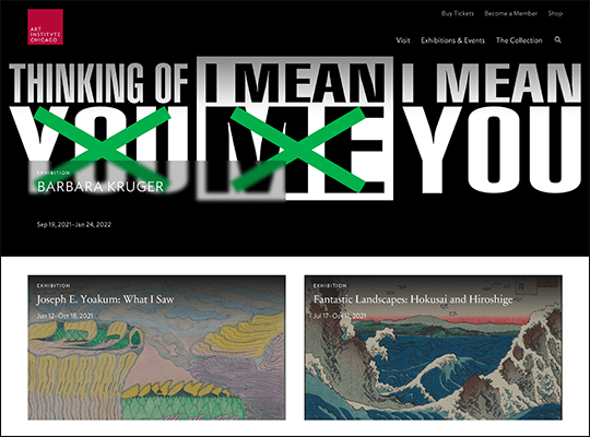
Art Institute of Chicago
As an art museum, the Art Institute of Chicago rightly devotes the entire above fold section of each page spotlighting a core exhibit to an image of a work of art. But the parts of their collection that aren’t receiving center stage aren’t completely neglected either, as their website provides visitors with a link to their entire collection, which is searchable by both keywords and categories. Once visitors find the artwork they’re looking for, they can view images of it and even zoom in to see fine details down to the texture of a painting’s canvas.
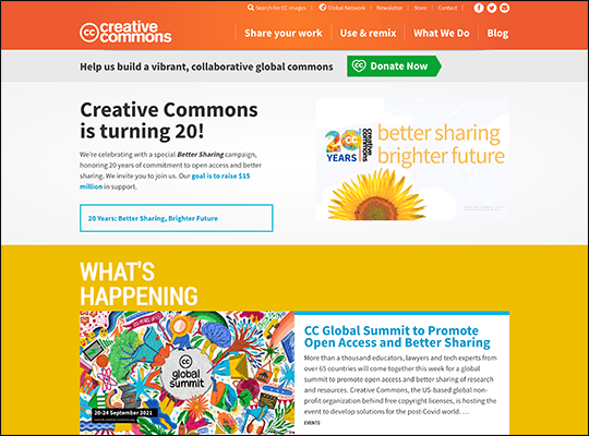
Creative Commons
The Creative Commons has a fairly unique mission among nonprofits, helping artists overcome legal barriers and understand copyright laws. As the impact of their mission might be difficult to grasp at first for non-creatives, their website smartly shows off a wide range of content that artists are free to use without fear of copyright claims. Each image is represented by a colorful tile, even the ones that can’t be represented by an image, such as audio recordings and educational texts. This choice simultaneously explains what their mission is, provides artists with a list of resources, and emphasizes the scale of their work.
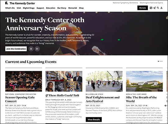
JFK Center for Performing Arts
The Kennedy Center for Performing Arts doesn’t just have a hero image—it has a hero video. This design choice shows off the vibrancy of the performances the center holds, while also being considerate of visitors by ensuring the video defaults to mute, so as not to startle anyone with a sudden burst of sound. The rest of their homepage also essentially functions as a highlight reel for their content, displaying quick lists of upcoming events, tickets on sale, and performances by category (comedy, dance, jazz, etc.). This lets visitors get a quick insight into what the Kennedy Center offers and helps them navigate to the section they’re most interested in.
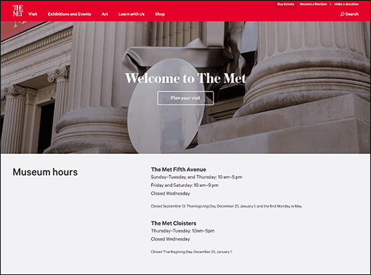
Metropolitan Museum of Art
For an organization with showstopping art, the Met chooses to keep its website’s design simple, providing visitors essential information like their hours and a link to plan a visit directly on the homepage. In keeping with the theme of straightforward simplicity, their ticketing page is designed for convenience. At the top of the page, visitors can select whether they are members, locals, students at a local university, or visitors to New York and get taken straight to the ticketing information that applies to them, creating a fast and informative ticket purchasing experience.
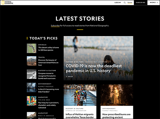
National Geographic
National Geographic keeps their website’s main menu as simple as possible with only four links immediately visible from their homepage. Visitors are invited to login, subscribe, renew their subscription, or see the whole menu. Those who do opt to see everything their website has to offer by clicking on the menu will learn why National Geographic initially takes a minimalist approach: they’re a large, long-standing organization and have 16 main topics and websites for visitors to explore. What is featured on a main menu and what gets relegated to a sub-menu is often a hot topic for web designers, and in National Geographic’s case, they’ve opted to put their calls to action front and center. Whether you agree with this approach is a matter of personal preference, but it can be an effective way to organize your website for nonprofits with a lot of content.
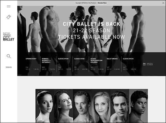
New York City Ballet
Visitors to the New York City Ballet’s website will first be struck by the strict black and white color scheme. With the exception of a few orange highlights for the calendar, everything above the fold is in grayscale, including both the animated background and headlining text (which is still fully readable, even as the background moves due to a subtle black outline around the white text). However, when visitors click to another page or just scroll down, they might be shocked to see colored images, as the previous sharp black-and-white only color scheme causes even plain photos to stand out.
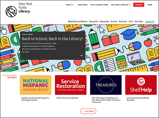
New York Public Library
The New York Public Library website’s colorful homepage combines a mix of graphics, photos, and typography to make an impression on visitors. Specifically, while most of the links to major topics on their website, such as how to get a library card or sign up for an online class, are introduced by a photo, all of their major spotlight items are paired with a text only image. These spotlight images still manage to be colorful and eye-catching, even as they forgo the usual school of thought of using images of people to instill a personal connection with visitors.
Portland Art Museum
The entirety of the Portland Art Museum’s homepage can be considered one giant, colorful menu. The series of photos with bold color filters placed close together might give some visitors the impression of visiting an art gallery from the moment they click on the Portland Art Museum’s website. However, among the series of different menus present, one of the most thoughtful choices is to have a link to information about the museum’s accessibility practices listed first among the items in its top right corner menu. The placement ensures this often buried link will be easy to find for relevant audiences.
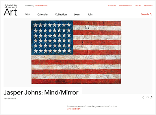
Philadelphia Museum of Art
Among the Philadelphia Museum of Art’s many pages, their calendar’s presentation might be the most inspiring design choice. As the museum regularly changes their many exhibitions, guests can use their calendar not only to see what exhibitions are available on a certain day, but also for a range of days by clicking the corresponding dates. Additionally, visitors can filter calendar content by its type, audience, and location, allowing them to plan the details of their future visit well in advance.
Smithsonian Institute
With the Smithsonian’s wide array of content and exhibits, their website prioritizes allowing visitors to search for what they’re looking for. Their website’s homepage features two search bars, one at the very top of the page and another more detailed search bar in the middle of the page, right under their basic welcome and visitor information. Visitors who click on the large category buttons above the search bar will then be taken to new search pages with relevant articles and a new search bar that will provide more refined results.
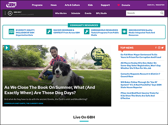
WGBH
Unlike most websites on this list, WGBH is just as interested in providing a positive audio experience as they are a visual one. Their menu features a play button for visitors to tune into their station right from their homepage. For added convenience, the menu also follows visitors as they scroll, allowing them to pause and resume playing their station as desired. Plus, visitors won’t have to worry about staying on the same page to continue listening to the radio, as the audio continues uninterrupted even as visitors jump from page to page, only changing when visitors hit pause or start playing a new radio station.
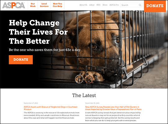
American Society for the Prevention of Cruelty to Animals
The American Society for the Prevention of Cruelty to Animals (ASPCA) is a powerful example of how effective a strong hero image can be at provoking an emotional response. Visitors to their website will be greeted with images of sweet looking dogs in poor conditions that take up the entire page above the fold. These images are likely to gain an immediate emotional response, and the ASPCA capitalizes on this opportunity by featuring two large, unmissable donation buttons as well as a place to sign up for their newsletters for guests who scroll down to explore. Those who make it to the bottom of their homepage will then be greeted with another similar image to those at the top (but with puppies this time) and one last call to donate, helping the ASPCA earn contributions from animal loving visitors.
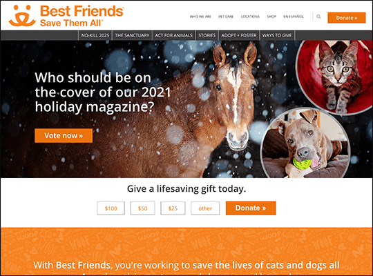
Best Friends Animal Society
As their organization’s name might suggest, the Best Friends Animal Society makes heavy use of emotional language in their marketing materials, including their website. The text on their hero images doesn’t ask visitors to adopt a pet but to consider what it’s like to “come home to happiness.” Their other primary call to action on their homepage, to donate, is paired with similarly emotive text, imploring visitors to “give a lifesaving gift.” While some nonprofits may feel loaded language like this is a bit over the top, others might agree with its merits as a persuasive marketing tool when used strategically.
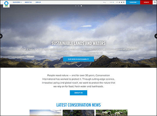
Conservation International Foundation
Environmental and animal rights nonprofits tend to be at an advantage for having eye-catching photographs of their work, and the Conservation International Foundation makes full use of this by decorating their website above the fold with bold pictures of plants, the ocean, and the sky to represent their cause’s work. Each of these photos is also accompanied by a link to their subject matters’ topic, allowing visitors to see more with just a click once a subject they’re interested in comes up. For guests who want to learn a little more about the organization in general, the Conservation International Foundation also provides a convenient arrow that automatically scrolls visitors down to their about information.
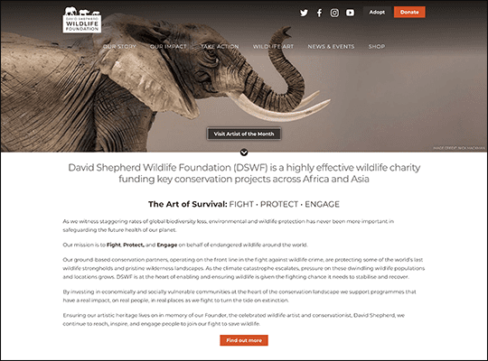
David Shepherd Wildlife Foundation
The David Shepherd Wildlife Foundation uses a mix of communication strategies on their homepage to appeal to a wide variety of visitors. For instance, they frame supporting a wild animal as “adopting” one, invoking an intra-personal connection while also likening wild animals to more familiar household pets. By contrast, their homepage also features a very aggressive call to action, likening protecting animals to a battle in which their supporters need to understand “the art of survival: fight, protect, engage.” Finally, the central call to action on their homepage is for visitors to explore their artist of the month, introducing a unique, creative way to support their cause by making a purchase.
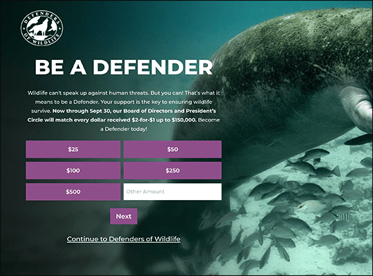
Defenders of Wildlife
Many nonprofits provide brightly colored donation buttons on their front pages to direct visitors to separate donation forms. The Defenders of Wildlife remove this extra step by embedding their donation form complete with suggested giving amounts straight into several of their pages. Their website also makes it as easy as possible for supporters to contribute to their advocacy efforts. Clicking the “Take Action” button on their homepage links visitors straight to an already completed email they can send to elected officials after filling out just their name and address.
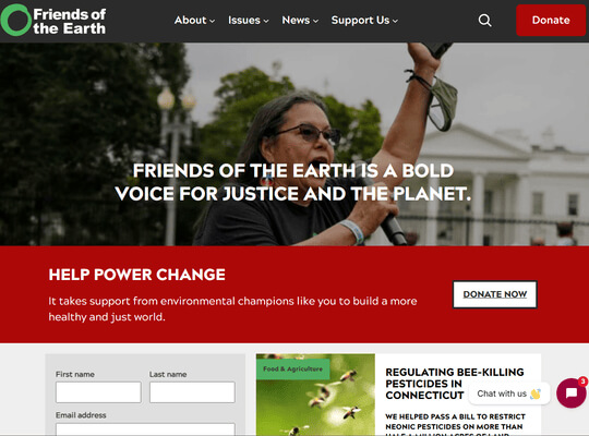
Friends of the Earth
Friends of the Earth (FOE) is a major environmental advocacy group focused on climate justice and conservation. The advocacy organization’s website prioritizes UX through clear navigation and strong calls to action (CTAs). Powerful imagery communicates their mission by showcasing wildlife and picturesque landscapes.
Recently, FOE partnered with Cornershop Creative to make this site possible. Cornershop did a full WordPress site rebuild using PHP and the native Gutenberg editor. Through the project, they modernized a platform that was previously restricted by outdated technology. The result was a faster, highly stable website equipped with streamlined backend workflows, a faceted blog search for easier content discovery, and flexible subsites that support diverse initiatives.
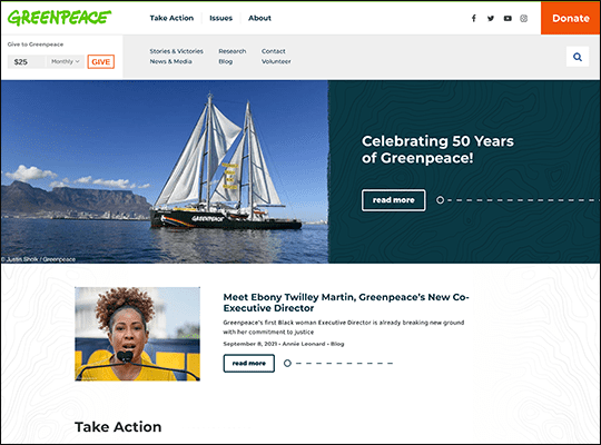
Greenpeace
It’s good practice to include a donation button on every page of your nonprofit’s website. Greenpeace takes this a step further by including a pop-up banner with suggested giving amounts in addition to their usual donation button on nearly every page on their website. Visitors who click on a donation amount are then directed to a fully branded donation form with both monthly and one-time donation amounts. Greenpeace continues to follow donation form best practices by offering higher suggested giving amounts for one-time donations, nudging visitors to become recurring donors.
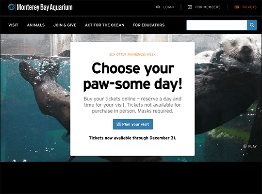
Monterey Bay Aquarium
The Monterey Bay Aquarium’s website takes a truly unique approach to the concept of hero images. Visitors are greeted with a video of the aquarium, showing off visitors enjoying looking out at the ocean while seagulls swoop past the camera, immersing website visitors. Then, as visitors scroll to learn more, the image changes seamlessly from photos of guests, to merchandise, jellyfish, and more. The website’s design also gives visitors the feeling of flowing from one piece of information to the next as the background feels like a static image with a stream of information boxes layered on top.
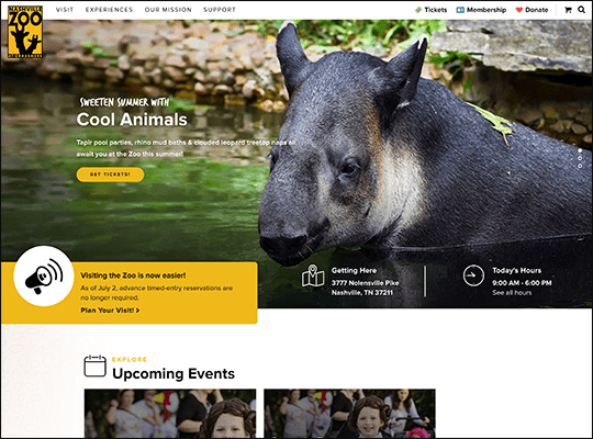
Nashville Zoo
The Nashville Zoo’s homepage proudly shows off a wide selection of their animals to entice website visitors into becoming zoo visitors. From bold hero images and a photo advertising their behind the scenes program that fittingly hides behind other elements as the visitors scrolls, to a carefully curated selection of photos of endangered animals to display the zoo’s impact, the Nashville Zoo thoughtfully varies its content to make a dynamic, colorful homepage. Plus, they’ve definitely taken user experience into consideration as their hours, location, and ticket check-out are all placed front and center. Visitors are still invited to donate and explore the rest of the website, but as an admissions-based organization, the Nashville Zoo has clearly made a deliberate choice to prioritize the needs of potential visitors.
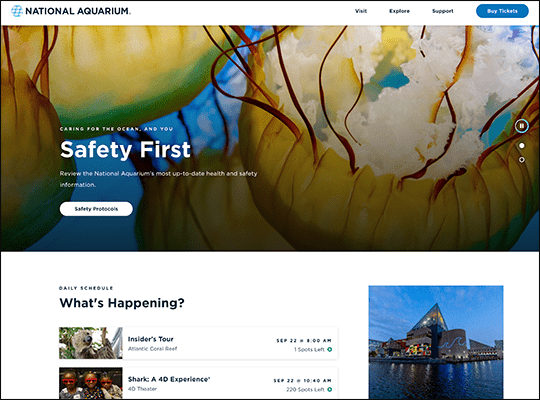
National Aquarium
The National Aquarium’s website has an exceptionally user-friendly and cleanly designed visitors page. At the top, visitors are presented with the ability to “dive deeper” into core aspects of planning a trip to the aquarium. Clicking on these links automatically scrolls visitors to the relevant section, all of which are marked with clear titles, helpful dropdown menus, and information boxes with color labels to keep the page bright and interesting looking as visitors browse. Also, the National Aquarium goes the extra mile on helping visitors find their location by providing information on common transportation methods guests might use.
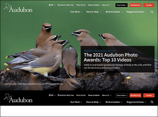
National Audubon Society
The National Audubon Society takes an interesting approach to their hero image. Instead of having a large image that visitors scroll past, their website has an eye-catching photo of a few birds that then disappears completely to reveal the rest of the website when scrolled past, even changing the size of the scroll bar. This approach essentially allows the National Audubon Society to gain the benefits of two common web design methods; they have an attention grabbing hero image to pull visitors in and are able to place pertinent information, news stories, and calls to action at the top of their page.
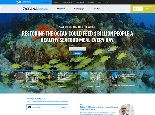
Oceana
Oceana’s mission is to help protect the world’s oceans. Appropriately, their website allows visitors to select what country they are from to view relevant efforts and news stories happening in their area. This approach allows Oceana to provide a more personalized website experience for visitors in North America, South America, and Europe, while other visitors are invited to view the broadly focused international version of their website. Plus, changing regions also sometimes changes the website’s language, allowing visitors across the world to learn about Oceana in their preferred language.
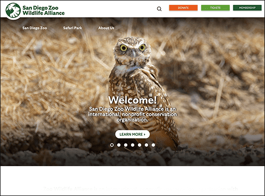
San Diego Zoo Wildlife Alliance
Photos are great for drawing visitors in, but a well crafted graphic can also help illustrate a specific point and attract attention, as the San Diego Zoo Wildlife Alliance showcases. To explain the scale and importance of worldwide conservation efforts, their website draws visitors in with a graphic of the world map with core locations spotlighted in bright, glowing colors. Then, each location is further represented by a photo of wildlife and an artful graphic created with limited colors that match their icon on the map. This creative choice makes their website more dynamic while also showing how photos and graphics can be combined to make a more varied visual experience.
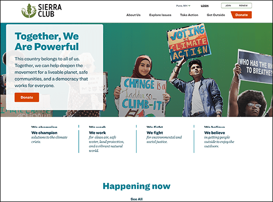
Sierra Club
Many websites have what are called “sticky menus,” menus that follow visitors as they scroll, allowing them to access key links without scrolling back to the top of the page. The Sierra Club chooses to do this not just with their standard top of page menu, but also with their social media and sharing links. This means visitors are prompted to tweet, create a Facebook post, and even print out information about the Sierra Club whenever the desire strikes them as they browse the website. Curious visitors who click on the plus icon can browse through a truly impressive selection of sharing options, including standard methods such as popular social media websites, email, and messenger, but also more obscure methods, including Adfty, Yummly, and SpinSpan. This means visitors can truly share the Sierra Club’s message whenever and wherever they want.
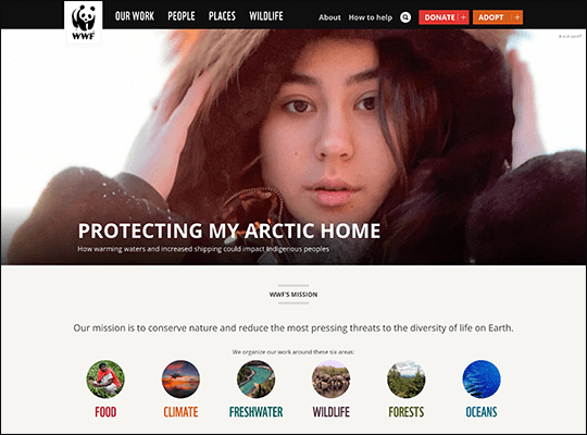
World Wildlife Fund
The World Wildlife Fund (WWF) has a mission that covers a wide range of ecological concerns, and their website succinctly represents these as colorful photographs cropped into neat, helpful icons. This allows visitors to quickly find the information they are looking for, while also freeing up the WWF’s hero image space to spotlight specific news stories and initiatives. For each of the WWF’s six core topics, visitors can view an informative article that walks through an overview of the topic, why it matters, what the WWF is doing about this issue, and finally how visitors can help. These articles are rather long, and the WWF helps visitors orient themselves by providing a progress bar at the top of the page, showing visitors how close they are to the end while also highlighting which topic they are currently on.
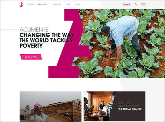
Acumen
Acumen has a bold logo of half of a bright pink capital A. This is a strong, immediately recognizable design, and Acumen has found creative ways to integrate it into their website’s design, creating a strong brand connection for visitors. Their logo—as half a letter—is used to divide their website above the fold in half, combining their logo, their slogan, and an eye-catching image of their work into one effective visual. While the rest of their website’s hero images aren’t this visually complex, they still follow Acumen’s branding style by using slanted lines and boxes to divide images, present text, and create buttons.
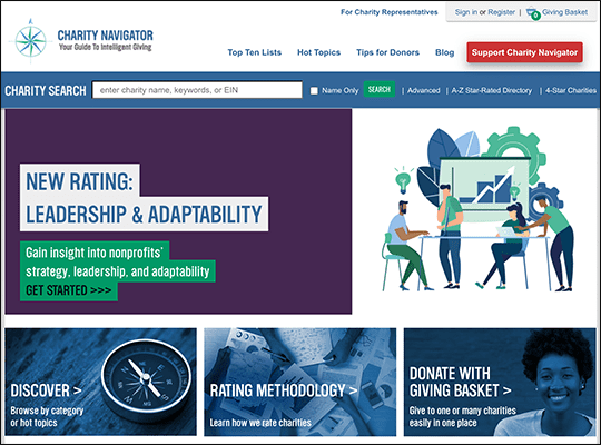
Charity Navigator
Charity Navigator helps individual supporters find nonprofits and charities that align with their values. Their searchable database provides a tool for visitors to browse for charities by industry, location, size, and more. Or, visitors curious to look up background information on a specific charity can just search the organization’s name to find what they’re looking for directly. But for those open to explore, Charity Navigator really shines by providing a varied selection of curated top ten lists that represent the best nonprofits their website has to offer for prospective donors.
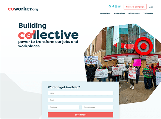
Coworker.org
Many nonprofits are likely familiar with the concept of featuring live campaigns and donation goals on their website. Coworker.org presents a twist on this idea with petitions. Their constituents are invited to create petitions hosted on their website, open for visitors to sort through and sign. Each petition gets strong visual support from the website with a feature image, artful color scheme, and signature thermometer to demonstrate the campaign’s progress. Plus, signers can help out even further with campaigns by sharing a message about why they’re supporting this cause, which the petition’s creator can then showcase on the page to rally even more support.
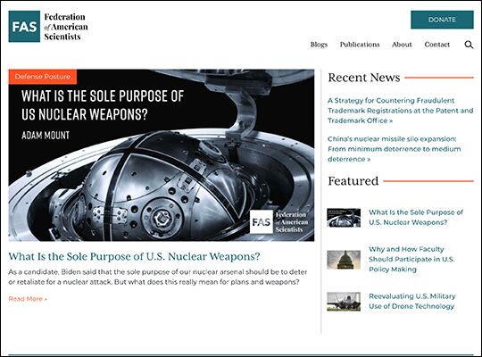
Federation of American Scientists
The Federation of American Scientists (FAS) shows how images can be used to strategically direct a visitors’ attention to and away from various parts of their website. While there should be no aspect of your website you don’t want visitors to see, pages such as your archive or years old blog posts likely aren’t as relevant to your current mission, though you would also hesitate to remove these pages. On their articles and reports pages, FAS pairs only their most recent and relevant publications with images, drawing readers’ attention to them first. Readers can still view old posts by scrolling down and looking through text links, but this web design ensures most new visitors will place their focus on FAS’s preferred publications.
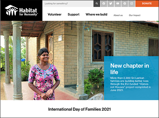
Habitat for Humanity
Habitat for Humanity is both a nonprofit that provides people with homes and a chain of low-cost furniture stores. Their website’s menu communicates both of the facets of their organization while also using typography to draw focus primarily to the nonprofit side, using larger text for calls to action to get involved than to make a purchase. Visitors looking to buy furniture are in no way prevented from finding shopping items, but this layout emphasizes Habitat for Humanity’s brand identity and core values for new supporters. They are a nonprofit first and a store second.
Web design by: Unknown
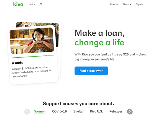
Kiva
Kiva is a kickstarter website with a twist. Instead of simply donating funds, supporters are invited to help fund loans with the expectation that they will be repaid (and Kiva assures supporters that they have an average 96% repayment rate). This is an uncommon nonprofit model, and Kiva smartly represents the process with an informative graphic on their “How it Works” page. The graphic walks visitors through the core steps, using colors and icons as appropriate to help communicate specific actions. Also, to emphasize Kiva’s mission of growth and planting seeds of success, the graphic is placed on a background of nature imagery, reinforcing Kiva’s brand identity.
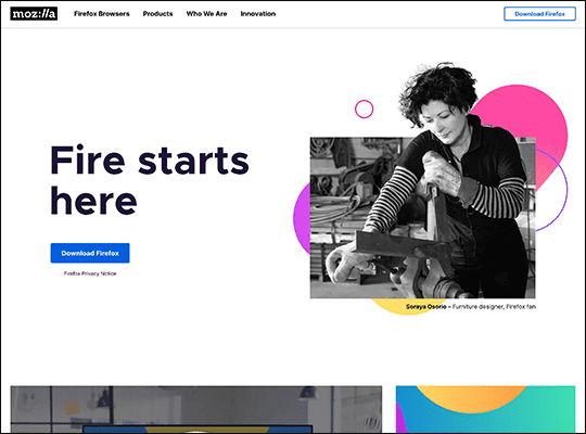
Mozilla
When most people envision mission-driven organizations, they likely don’t think about web browser providers. However, Mozilla’s website both prompts their free browser and demonstrates how nonprofits can keep their mission page dynamic with a little typographic design. Mission statements can be difficult to represent visually as it’s important not to draw information away from the text while still keeping visitors engaged. Mozilla artfully breaks up their mission statement with different text sizes, short paragraphs, and a variety of text presentation styles, including paragraphs, bullet points, and lists.
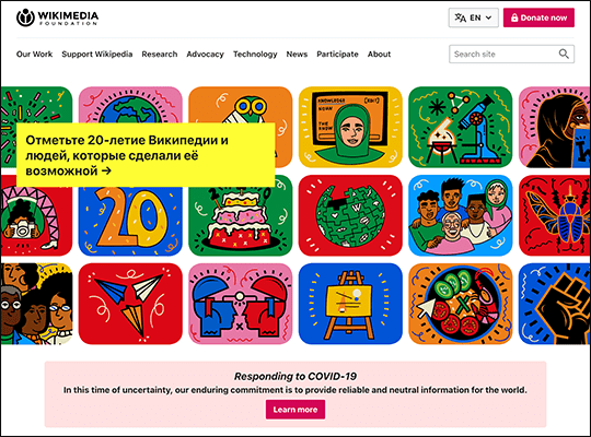
Wikimedia Foundation
Wikimedia Foundation supports Wikipedia and the pursuit of providing free, globally sourced information worldwide. Their website reflects this mission by providing their call to action in a variety of languages against a scrolling background of icons that represent a wide variety of information on art, science, and culture. Their 20 year celebration page takes a similar approach with icons that change both when a visitor hovers over them and on their own over time. Slowly changing images provide movement that catches the eye and can also intrigue visitors into staying on a page to see how it will shift and move, increasing session times.
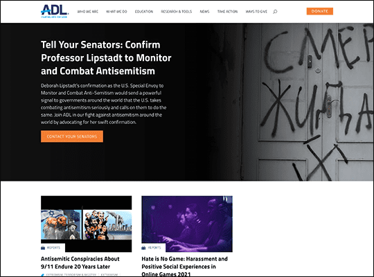
ADL
Brightly colored links and buttons help attract your visitors’ attention to essential parts of your website. ADL provides an example of how nonprofits can take this to the next level by adding even more visual interest to these key buttons with animations and graphics. Visitors that hover over ADL’s donation button will see the button change color in a swipe effect, as if preemptively moving the visitor towards the next page. To further emphasize this, ADL also animates an arrow seemingly popping out of the text, adding to the sense of movement created by the swipe effect.
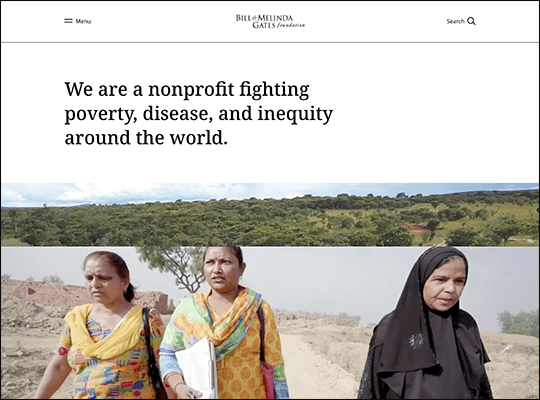
Bill and Melinda Gates Foundation
The Bill and Melinda Gates Foundation employs a simple black-and-white color scheme for their backgrounds, text, and graphics, letting photos of its nonprofit at work speak for themselves. Additionally, the website’s large margins add to the classy aesthetic, feeling not like empty space but like a purposeful choice. Their homepage brings this minimalist look together with deliberate font and text choices. The page title and many of the headings are quite long and written in serif font, adding a sense of connection and flow between letters that is often absent on webpages, which favor sans-serif text and short, punchy titles. While standard web design principles exist for a reason, purposefully breaking them with the intent to create a unique design can help your website stand out from the crowd.
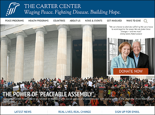
Carter Center
The Carter Center operates in more than 80 countries around the world. To explain the scope of their work, the Carter Center has a semi-interactive map graphic. The map is color-coded to represent the Carter Center’s types of initiatives, and each initiative can be toggled on and off to help visitors both find the programs they’re most interested in and take in the extent of the Carter Center’s global work. Specific countries can then be selected from the list below the map, where visitors can learn more about the Carter Center’s efforts to “wage peace,” “fight disease,” or both.
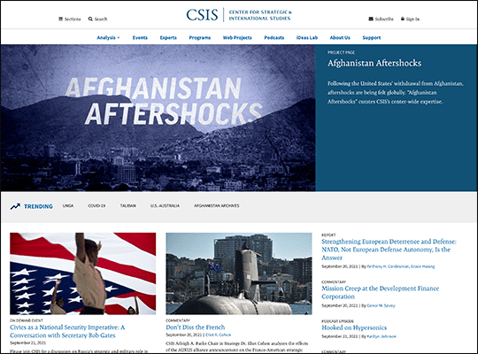
The Center for Strategic and International Studies
The Center for Strategic and International Studies (CSIS) keeps their website’s pages short. While many organizations create lengthy homepages that encourage long page session times, CSIS seems to take the opposite approach, providing short pages with a variety of links to encourage continued exploration of their website. Wherever possible, CSIS seems to default to creating landing pages for their primary menu links, pushing visitors to increasingly specific and detailed searches rather than providing an overview or generic information on a topic. While this approach may not be right for every nonprofit, given the complexity of CSIS’s work, it’s likely more effective to show exactly what they do rather than attempt to create a reductive summary.
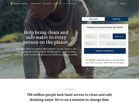
charity: water
charity: water’s homepage features a donation page embedded right at the top of the page alongside their hero image. In addition to putting donations front and center, this short form manages to follow a variety of donation form best practices, including defaulting to charity: water’s monthly giving program, providing suggested giving amounts, and even providing an example for donors of what a specific donation amount will accomplish. Not to mention, pairing this donation alongside their moving hero image serves to help supporters visualize what their donation would look like in action and who it might help.
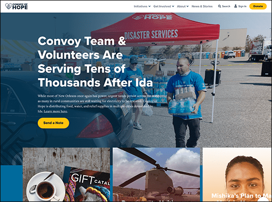
Convoy of Hope
Convoy of Hope uses a mix of graphics and photographs to convey their mission’s importance. Those familiar with nonprofit websites have likely seen many of their simple icons and graphics before, such as hearts with a slight shine or an outstretched hand accepting a donation. However, Convoy of Hope is sure to use these graphics as supplemental images for text already promoted by a more striking photo. For parts of their websites where graphics stand alone to visually represent the text, they’re sure to use more complex, unique graphics. Not to mention that using simplified graphics also fits with Convoy of Hope’s logo and brand identity.
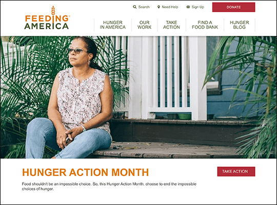
Feeding America
Helping your website’s visitors create an emotional connection with your cause is necessary for earning increased donations and support. Feeding America supplements their photos of constituents with anecdotes from people they’ve helped to cement this personal connection, even featuring professionally shot video interviews on core pages of their website. Plus, Feeding America also does volunteer spotlights, highlighting the efforts of individual volunteers to help visitors envision themselves as volunteers, thank hardworking volunteers publicly, and demonstrate the important work their volunteers do.
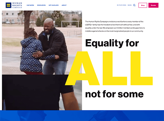
Human Rights Campaign
Many websites use subtle color filters over photos to help them better align with the rest of the website’s color palette and the organization’s brand identity. The Human Rights Campaign’s website demonstrates how filters can also be used to turn photographs into more abstract visuals and graphics, which might be useful for nonprofits without a dedicated graphic designer. In the Human Rights Campaign’s case, their brand colors are a bright blue and yellow, and these heavy filters are used to both help bring images together and throw them into contrast with one another, even using a heavily filtered photograph as a background for text in their other brand color at one point on their homepage.
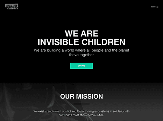
Invisible Children
Invisible Children’s website plays with color, shadow, and interactivity in unique ways. While most of their website is in grayscale or muted colors, their brand colors are actually black, white, and bright green. This sharp contrast is used to draw attention to key links, such as donating. The relatively somber aesthetic of the rest of their website causes these buttons and highlights to stand out all the more, and even give them the feeling of bringing light or growth to this dark issue. This can further be seen through a series of photographs about halfway down the homepage that grow and light up when hovered over by visitors.
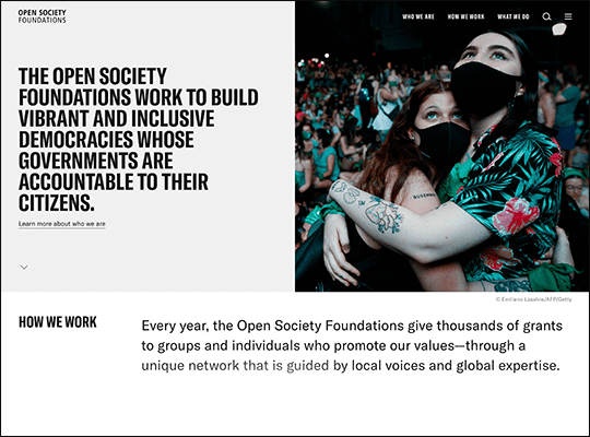
Open Society Foundations
Here’s something few websites consider: transitions between links on pages. Open Society Foundations uses a simple website layout, deliberate color choices, and a wipe effect to create the illusion of a near seamless website. Instead of jumping from page to page, everything feels connected thanks to these few design choices. This feeling of interconnectedness is further supported by the amount of interactive text on their website. Hovering over text will cause new information to be revealed, white out other menu options, and more, intriguing visitors to continue exploring the website and reading text to find new information and discover how Open Society Foundations chose to visually represent it.
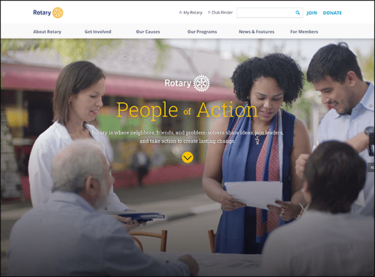
Rotary International
Ambitious nonprofits can take notes from Rotary International’s website. Nearly every aspect of their homepage is animated, creating the feeling of being built right before a visitors’ eyes as they scroll. Among their standout effects are the buttons at the bottom of the page that become transparent with the photo behind them when hovered over, the animated line that draws the whole page together and signals to visitors when they’ve reached the bottom, and the variety of simple graphics used to convey Rotary International’s major accomplishments.
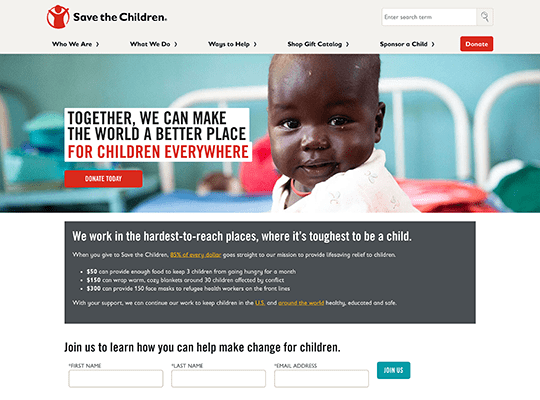
Save the Children
Supporters want to donate to charities that will follow through on their promises. Save the Children helps ease visitors’ minds by boldly providing reviews of their own nonprofit from trusted charity rating websites, allowing visitors to examine them and come to their own conclusions. Of course, as Save the Children is near-universally highly rated, this approach also serves to help establish their credibility and persuade even skeptical visitors into considering making a donation. This can best be seen as Save the Children ends their review section with a more straightforward FAQ, directly answering core questions about expenditures that may have only been touched upon in the previous assessments.
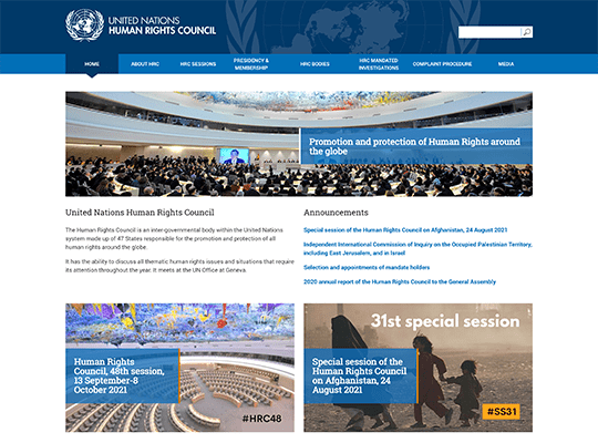
UN Human Rights Council
The UN Human Rights Council has a very text-heavy website, relying on effective text hierarchy rather than images and graphics to draw visitors into their content. Despite having few images or visuals, they still manage to make their page layouts interesting by making effective use of columns. For instance, their homepage has a banner image that stretches across the page, then two columns providing the page’s core content, and is finally capped off with a menu that divides the page into four sections. However, clicking on this menu’s items creates either two or three columns, adding even more visual interest.
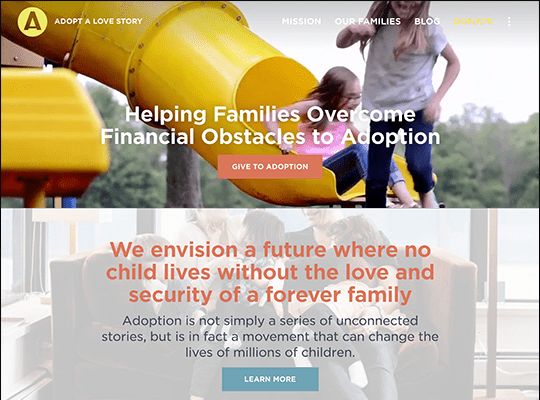
Adopt a Love Story
If you want to be certain that visitors will view your website’s visuals in a specific way, consider implementing controlled scrolling like Adopt a Love Story’s website does. Adopt a Love Story’s homepage has no scroll bar, and visitors who scroll with their mouse wheel or arrow keys will automatically be moved the correct distance to view the entire next section of the page, ensuring the visuals align exactly how the organization intends. They even make use of this stop-and-go method of scrolling by timing animations to appear after a visitor pauses on a specific section for a few seconds, making each part of the homepage feel unique and important.
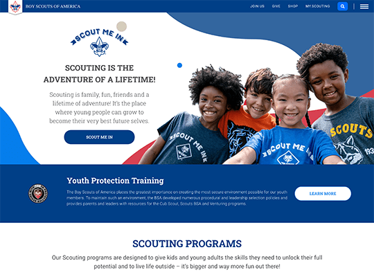
Boy Scouts of America
As a longstanding organization, the Boy Scouts of America both establishes their brand identity and dispels a few common assumptions about their organization immediately with their website design choices. For instance, the website primarily relies on photos of people to help visitors make a connection with the organization but also uses these photos to demonstrate that the Boy Scouts of America is a diverse organization that, despite its name, accepts girls as well as boys into their programs. They also make the unique stylistic choice to remove the backgrounds from more of their photos, placing their scouts straight onto the colorful backgrounds of the website. Sometimes lots of photos can give websites an overly boxy appearance, and this solution works well for organizations interested in focusing solely on the photos’ subjects and not their backgrounds.
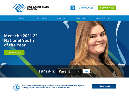
Boys & Girls Club
Data visualization is key for getting important statistical information about your organization across to potential supporters. The Boys & Girls Club’s website has a strong example of a colorful icon and loading bar combined together. The icon helps convey the meaning behind the statistic even before visitors read the accompanying text, while the loading bar’s circling movement around the icon helps draw a visitor’s eye. Additionally, the choice of a loading bar makes sense as the Boys & Girls Club uses this visual to represent percentages they aim to increase to 100%, such as high school graduation rates.
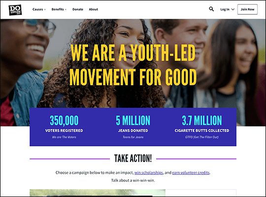
Do Something
Effective nonprofit marketing combines both emotional appeals and facts to back them up. Do Something shows off how these can be presented together to make a quick sales pitch to new supporters on their website’s homepage. Their hero image focuses on one of their constituents while the other people in the photo are out of focus, encouraging visitors to make a connection with an individual. Right below this image, Do Something then presents a few statistics about their organization’s impact, which helps to reinforce the initial emotional response invoked by the photo with hard data.
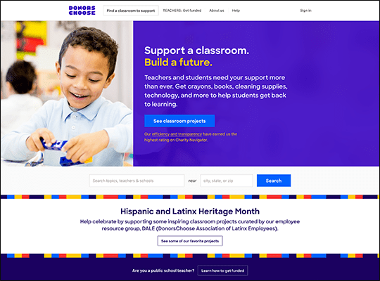
Donors Choose
Nonprofits that host their constituents’ crowdfunding campaigns on their website can sort them in a variety of ways. Some might choose to organize them by promoting the ones closest to reaching their goal, but that has the potential to create a cycle where the most successful campaigns continue to find success while those that need assistance are left behind. Donors Choose instead promotes campaigns that are currently receiving matching donations, driving increased support while helping top campaigns get finished fast. Plus, they make sure to highlight these donation bonuses on both the main list of campaigns and on the donation form on individual campaigns, even telling donors how much they’ll need to donate to complete the campaign for those that are close to their goal.
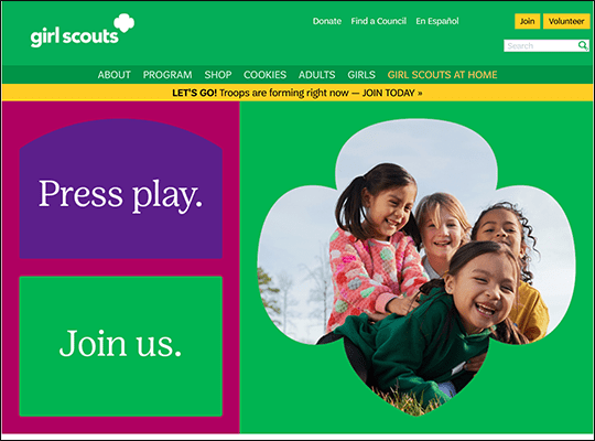
Girl Scouts of the USA
The Girl Scouts of the USA makes the unique web design choice to add margins to the side of their content, creating large white spaces on either side. Many websites use this spacing strategy as a place for ads or banners, but others, like the Girl Scouts, use it as a general content organization strategy. Additionally, this technique ensures that line lengths will always be relatively short. Line lengths of above 50-60 characters can be difficult to read or make the text appear longer and more dense than it actually is. Keeping line lengths short encourages more engagement as it makes the text easier to consume, even if it’s the same content, just arranged in a different way.
Room to Read
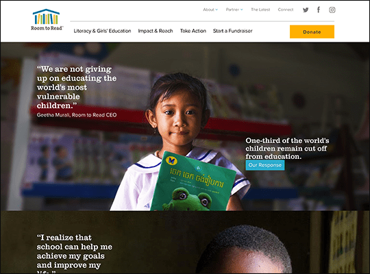
Nonprofit professionals understand the importance of creating an emotional connection with their audience and know that a website’s images are a key chance to do this. Room to Read meets all of the criteria of effective image use, picking photographs of single individuals making eye contact with the viewer. In fact, Room to Read doesn’t just follow these principles for their hero image, but for nearly all of their photographs of the children their program supports, even using these effective visuals to build a collage of icons representing the 23 million children they’ve helped.
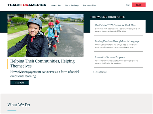
Teach for America
While much of Teach for America’s website is text-based, the most impressive feature of their website is their interactive region map. Visitors scrolling through their homepage will likely be drawn in by the sole animated graphic of the map of the United States suddenly zooming out to show all of Teach for America’s locations. Then, visitors are invited to interact with a map, clicking on highlighted dots to bring up information about local programs, including their year established, size, and whether they are urban or rural. This level of interactivity encourages visitors to engage with Teach for America’s content and emphasizes just how widespread their impact is.
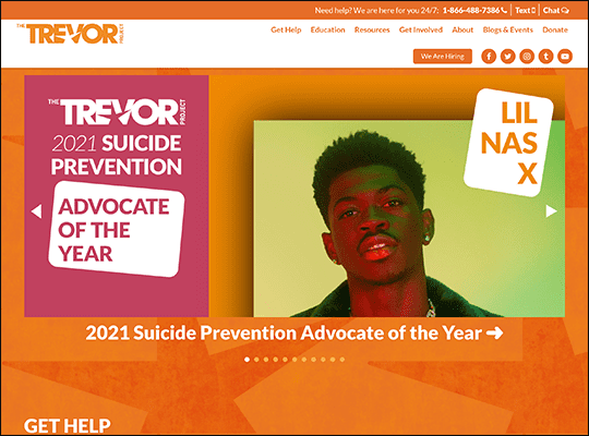
The Trevor Project
Most nonprofits have a call to action that they hope their website’s visitors will act on at some point. Others, like The Trevor Project, have services that they need to prioritize drawing attention to, especially if they are meant to respond to an urgent need. As such, The Trevor Project understands there is no need to be understated when presenting vital information such as their contact information and presents their helpline’s phone number in exceptionally large font in multiple places on their homepage, ensuring that it’s unmissable for anyone in need. The rest of their website also balances this rather heavy subject matter with bright colors, including their brand’s glowing orange and LGBT+ pride rainbow.
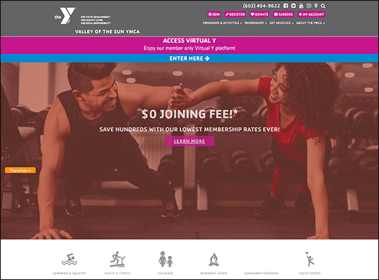
Valley of The Sun YMCA
Sometimes it can be difficult to maintain your brand’s colors throughout your website while also adding a variety of photos. Valley of the Sun YMCA has a bright pink and blue color scheme and ensures their photos create a cohesive visual experience by adding pink and blue filters to them. These bright color choices are also carefully balanced with a neutral gray for the menus on top of and below the hero image. This visual space helps break up the barrage of images, allowing visitors to better take in the next set of colored visuals when scrolling down, instead of feeling overwhelmed or making the website feel too cluttered.
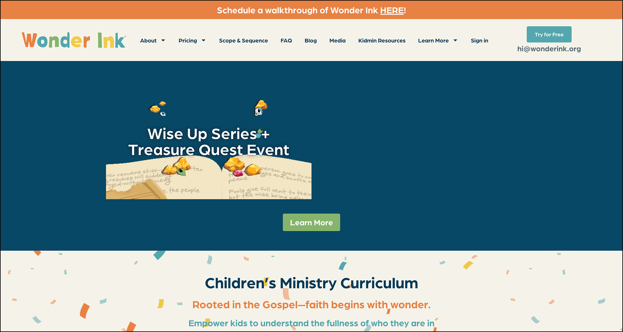
Wonder Ink
Wonder Ink is a children’s ministry platform that creates Bible-based curriculums tailored for different age groups. Used by church leaders, teachers, and parents, these lessons offer activities that spark children’s curiosity and faith. Wonder Ink’s website leverages fun, animated graphics to engage visitors and draw attention to important information. The site features strong testimonials, straightforward CTAs, and clear navigation.
Plus, they maintain an informative blog that’s optimized for search engines. Through a partnership with Nexus Marketing, David C Cook, which is their parent company, now ranks for 187 of their most important keywords on page one, compared to 5 when the partnership first started. They’ve achieved a substantial 48% growth in organic traffic, broadening the reach of Wonder Ink’s online curriculum.
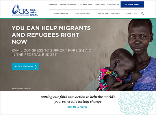
Catholic Relief Services
Catholic Relief Services, like many religious organizations, shares statements about both their mission and their religious values on their website. This type of content tends to be text-heavy, and, while important, can be difficult for readers to consume quickly. To compensate, the Catholic Relief Services uses a variety of text hierarchy strategies to break up their text and make it engaging. For example, bible verses are used as breaks between sections in their religious statement, but they also are sure to vary the font size and heading color to make sure the visual of breaking up text with more text makes the page easier to read.
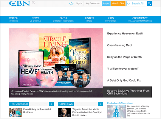
Christian Broadcasting Network
As a broadcasting network, the Christian Broadcasting Network’s (CBN) homepage is full of videos and audio clips for visitors to explore, helping them get a sense of CBN’s usual content. Their website also shows how particularly large nonprofits can use ad space to market their own products and programs. While your nonprofit may wish to avoid third-party ads, marketing your own programs on your website can help you gain additional leads.
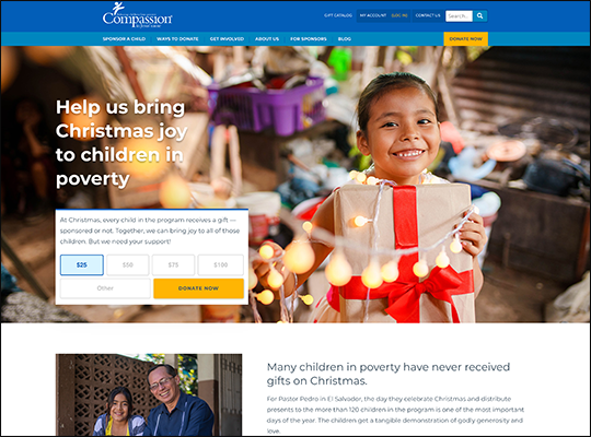
Compassion International
Your website should have content not just for new visitors but your current supporter base, as well. Compassion International’s dedicated section for their current supporters allows them to get involved further with the cause, reading stories about children being supported and engaging in opportunities outside of additional donations, such as letter writing, prayer, and even visits. Not to mention, their page has strong organization, adding the name of each country and the area of focus to each story, deliberately spacing text boxes to create margins, and varying up the content presentation style to create a dynamic page.
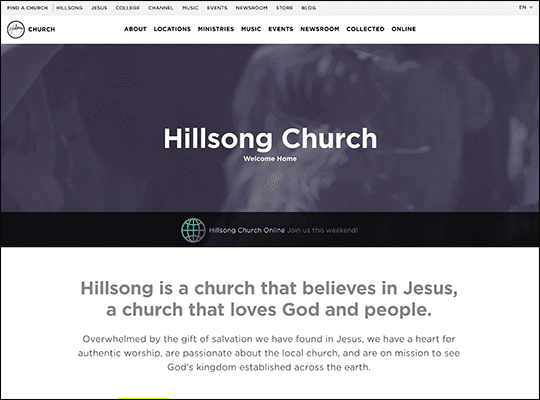
Hillsong
Hillsong’s website makes effective use of both standard web design principles and search engine optimization best practices. Their website hosts an extensive blog, with an archive dating back to 2010 and hosting well over a thousand blog entries. Yet, even with so many posts, content quality has not decreased. Posts vary from personal stories to sector-specific tips to videos and updates and updates about Hillsong. Plus, blog posts are loaded with eye-catching images, just like those decorating the front page, to make visitors stop and appreciate each post. Such diligent blog practices signal to search engines that their content is new and relevant, which can only help them achieve higher search results rankings for their content.
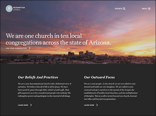
Redemption Church
When taking photos of your organization’s work and buildings, consider how you frame your subjects. Redemption Church’s website features striking photos of all of their buildings, instilling a sense of grandeur and awe. Additionally, Redemption Church chooses photographs that display a level of artistry and professionalism throughout nearly their entire website, from their hero image of a glowing sunset to feature images for their programs. When paired with their simple color scheme, these photos are able to speak for themselves, establishing Redemption Church’s brand as sophisticated, elegant, and knowledgeable.
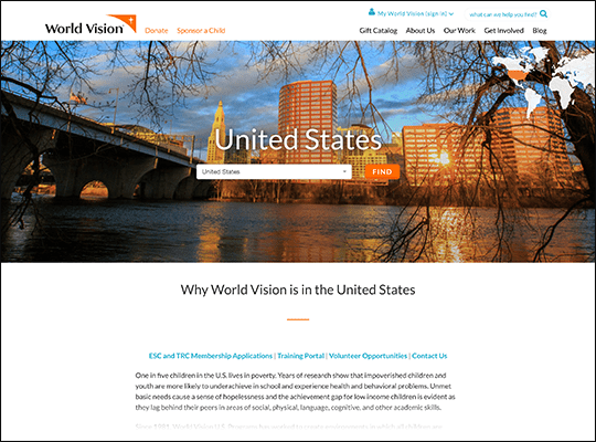
World Vision USA
Donors like to know what their contributions are specifically supporting. Some organizations provide examples of the kinds of impact a donation might have, while others, like World Vision USA, allow donors to directly choose how they help by creating a gift store. Donors are still encouraged to give normally, but those who want to know exactly how their money will be spent can purchase gifts for constituents straight from World Vision’s gift catalogue, much like they would complete their usual online shopping. World Vision puts a standard price on each item, but also allows donors to choose their donation amount, giving those who want to give more a chance to do so, while still controlling how their gift is spent.
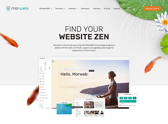
Morweb
To build a strong nonprofit website, you’ll need a reliable and comprehensive CMS. Morweb is the leading CMS to build beautiful websites that attract and retain supporters. Best of all, no coding is required to kickstart your web design and development! With its intuitive front-end editing tools and drag-and-drop interface, nonprofit professionals with any level of web design experience can create a visually appealing and informative digital hub for their organization.
Morweb has a full suite of nonprofit-specific features to support your web development efforts, including:
- Usability. With easy set-up and simple editing and managing tools, your nonprofit can leverage Morweb’s user-friendly system to bring your web design ideas to life with ease.
- Customization. A branded website can help your organization boost its credibility, increase its brand visibility, and establish an emotional connection with its supporters. Morweb helps you easily add in custom elements, from your color scheme to inspiring page themes, that make your website unique to your organization.
- Support. As you launch your website design journey, chances are you’ll run into some questions. Morweb offers regular customer support on a weekly basis so you can get your questions answered quickly and continue to push your web design efforts forward.
- Mobile-Responsiveness. Morweb automatically optimizes your website for mobile devices so supporters can explore your website and donate from anywhere, at any time—as long as they have their phone in hand.
- Reporting and Analytics. Morweb has built-in data reporting capabilities so you can assess your website’s performance and adjust your strategies as needed to keep site visitors engaged.
- Security. Your website will likely be a hub for sensitive donor data like contact and billing information. In order to keep this information secure and protect your website from cybersecurity threats, you’ll need a CMS like Morweb that automatically rolls out security updates and keeps your source code private.
Your web design journey with Morweb is powered by a monthly subscription fee, with different pricing packages to provide you with everything you need plus a built-in customer support team. This will save your nonprofit time, money, and headaches in the long run. Work with Morweb today to make your website design dreams a reality.

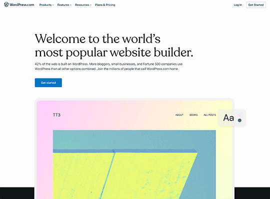
WordPress
WordPress is a popular open-source CMS with thousands of integrations and plug-ins. Plus, with over 10,000 free website themes, you can easily find a design that will resonate with your organization and help you stand out from the crowd.
WordPress has the following key features that make it appealing to nonprofits:
- Free access. WordPress is free to use, making it a great option on the surface for nonprofits on a budget. However, the third-party plugins that your organization will need will likely add up, causing you to incur more costs along the way than you were expecting.
- Mobile-friendly themes. WordPress offers nonprofits plenty of mobile-friendly themes to choose from, allowing mobile users to easily navigate your site.
- SEO-friendly. With SEO WordPress plugins, you can make sure your website is SEO-friendly so you can increase your page ranking on the search engine results page and therefore your brand visibility.
Because WordPress is an open-source platform, it’s susceptible to cybersecurity threats and data leaks, making your private information vulnerable. Plus, it will take time and previous expertise to download and set up the many third-party plugins and integrations your organization will need. WordPress is therefore ideal if you already have web development experience and aren’t planning to hold sensitive donor information on your site.
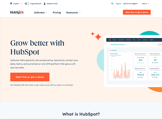
HubSpot
HubSpot is a CRM platform and a CMS with comprehensive tools. Its CMS is free to the public and has drag-and-drop functionality to make the web design process simple.
HubSpot offers organizations the following top features:
- Custom domain mapping. With HubSpot, you can create a domain unique to your organization, making it easy for your supporters to find you online.
- Blogging capabilities. Create a highly engaging blog roll that keeps supporters up to date with your recent projects, fundraisers, and more.
- Lead capture tools. To drive onsite conversions, HubSpot allows you to create streamlined forms, such as your nonprofit’s donation page, and leverage a landing page builder so you can gather donor information.
HubSpot’s capabilities are limited in its free version, so your nonprofit will end up paying a steeper price to access its more advanced features. HubSpot also uses its own coding language, called HubL, which users will have to familiarize themselves with to use the platform effectively, which can be overwhelming for first-time developers. HubSpot is best for developers with some web experience under their belt, though it still offers several user-friendly tools to make building a website a little easier.
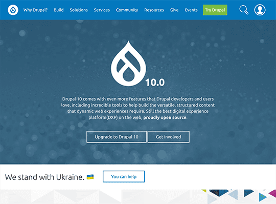
Drupal
Drupal is another free and open-source platform that has helped over 3.1% of the top million websites worldwide establish themselves online. Drupal is well-known for its robust community of users that provide helpful tips and support to one another.
Drupal offers nonprofits the following tools and features to drive their web design efforts:
- Thousands of plugins. Drupal offers layout builders, social feed widgets, form builders, and more so you can create a strong website that attracts users and gives supporters the information they need.
- Built to scale. Drupal offers support to build your website over time as your needs and the size of your organization change.
- Flexibility. Whether your organization needs to build a storefront or create a blog roll, Drupal can be customized to meet your organization’s web design goals.
Drupal’s latest update, Drupal 10, offers more features than ever before to simplify the web design experience. However, Drupal is still vulnerable to security risks because of its open-source platform. Plus, its plugins can end up being pricey. Drupal is best for developers that have previous experience installing plugins and are eager to connect with a large community of users to gather web ideas and insights.
Additional Resources To Elevate Your Nonprofit’s Website
A well-designed and optimized nonprofit website is a powerful tool for driving engagement, donations, and sales. By exploring examples and incorporating strategies like SEO, your nonprofit can significantly boost its online visibility. Remember, the key to success lies in continuously refining your website to meet your audience’s evolving needs.
For further reading on how to create the best nonprofit website possible, check out the following:
- Creating Meaningful Online Donor Experiences: 5 Strategies: Discover practical strategies to create engaging and meaningful online experiences that keep your donors connected and inspired to support your cause.
- Choosing a CMS: 3 Tips Your Nonprofit Needs to Know: Learn essential tips for selecting the right content management system to ensure your nonprofit’s website is user-friendly, scalable, and effective.
- SEO for Nonprofits: Crash Course & Get-Started Guide: Dive into this comprehensive guide to understand the basics of SEO and get started on optimizing your nonprofit’s website for better search engine rankings.
EXPLORE OUR NONPROFIT RESOURCES
Sign up for a webinar, tune into a podcast, take a course, or access a guide on a vast array of topics including fundraising, board governance, marketing and communications, and much more!
We are renowned for our top-nonprofit lists including the best logos, websites, and degree programs. We also have an ever-expanding blog full of valuable information to help your not-for-profit org reach its potential.