Your website is one of the most important tools your nonprofit has at its disposal. It’s a marketing, fundraising, and educational resource all in one!
However, not all nonprofits use their websites to their fullest potential. As a result, they may miss out on additional support that they could easily secure with simple fixes to their website.
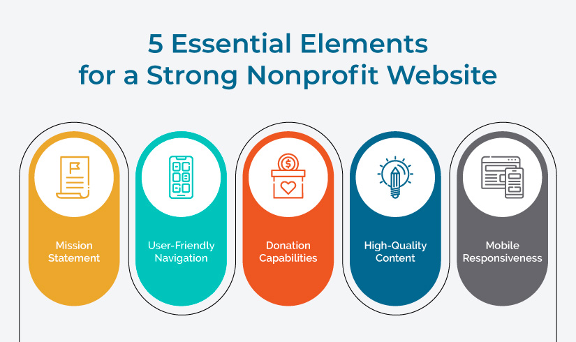
Make sure your website serves its purpose and provides value to your supporters. Whether you’re creating your nonprofit’s website from scratch or just revamping it, including the following nonprofit website elements will ensure your site is a complete and useful resource.

1. Mission Statement
Your mission statement encapsulates what your organization is all about. It explains your nonprofit’s purpose in a concise, compelling way that encourages people with similar values to get involved.
For example, Teach for America’s mission statement explains that the organization “finds, develops, and supports equity-oriented leaders—individually and in teams—so they can transform education and expand opportunity with children, starting in the classroom.” From this statement, you can quickly understand that Teach for America shapes educators to take on the classroom and help students across the country.
It’s important to feature your mission statement on your website so visitors—whether they’re potential donors, volunteers, or beneficiaries—can quickly understand what your organization does. Include this statement on your homepage, About page, and Donate page for better visibility.
2. User-Friendly Navigation
Make it easy for visitors to navigate your site. A user-friendly navigation encourages visitors to explore all your organization has to offer and decide whether (and how!) they’d like to engage with your nonprofit.
To ensure your site is user-friendly, include the following elements:
- Main menu. This menu should be at the top of your website and link to the most important pages. If you have many resources you’d like to feature, you can create a mega menu with dropdown lists under each section.
- Logical organization. Organize your navigation and content in a logical way. Include clear labels for each section, and ensure the linked pages are relevant to their categories. For example, your Resources tab may have links to your Blog and Webinars subsections.
- Search bar. Sometimes, visitors know exactly what they’re looking for on your site. Speed up the navigation process by adding a search bar where users can type in their desired topic or resource and quickly navigate to it.
Additionally, Cornershop Creative explains that the best nonprofit websites are accessible to all. To enhance accessibility, include bypass blocks and hidden links that allow users to skip sections of repetitive content to ensure that focus doesn’t get trapped in the navigation on each new page when navigating using a keyboard.
3. Donation Capabilities
Your donation page is one of the most important areas of your website. It allows you to collect funds that ultimately support your nonprofit’s mission, activities, and beneficiaries.
When creating or updating your donation page, make sure it features:
- A simple donation form. Streamline giving with a simple donation form. While other pages of your website may contain several paragraphs of content, be careful not to clutter your donation page with extraneous information.
- Different giving options. When you offer a variety of giving options, you make donating more convenient for donors, encouraging them to contribute. For instance, you may accept donations through traditional payment methods like credit or debit cards and newer platforms like Venmo and Apple Pay.
- Clear calls to action. Users on your donation page should know exactly how and why they should contribute to your organization. Include clear calls to action that demonstrate the urgency behind donating to your cause. For example, a children’s hospital may include a call to action during the month of December that states, “Donate now to brighten a child’s holiday season.”
Remember that your donation page is the central page for both your offline and online fundraising efforts. You’ll likely leverage a variety of marketing tools, such as social media, email, and direct mail to drive traffic to this page, so it’s important to keep it up to date and easy to use.
4. High-Quality Content
Include a variety of high-quality content to enhance your website. This content may be educational or promotional in nature. Educational content may expand on topics your supporters would benefit from learning more about while promotional content may include information about your services, upcoming events, or volunteer opportunities.
The types of content you may feature include:
- Images
- Videos
- Blog posts
- News articles
- Webinars
- Podcasts
These resources add value to your website by expanding upon your services, demonstrating thought leadership on topics relevant to your organization, and engaging your supporters. To bring your content to life, incorporate stories about your beneficiaries and real-life examples of your work that elicit emotion from visitors.
5. Mobile Responsiveness
According to Tatango’s text-to-give guide, about 33% of donation transactions and the majority of nonprofit web traffic come from mobile users. That’s why it’s so important to create a website with mobile responsiveness.
Your nonprofit site should adapt to various screen sizes and devices. The text and images should be legible no matter which type of device visitors are using. Consider using a content management system (CMS) that allows you to automatically adapt your content for mobile.
If you’d like to audit certain pages for mobile responsiveness, use a tool like Google Lighthouse that will flag any issues. Then, you can make the necessary changes to transform these pages for mobile users.
With these five nonprofit website elements, your site will be set to increase donation revenue and keep your supporters informed about your organization. If you’re developing a nonprofit website from scratch, consider working with a nonprofit website design company. They’ll have the expertise to create a user-friendly, mobile-responsive site that inspires visitors to get involved. As a result, you’ll have more time to focus on what your nonprofit does best—providing services to its beneficiaries and engaging donors and volunteers.
